In Creatin Capabilities, Martha Nussbaum discusses why per capita GDP is a poor indicator of well-being in an economy. Per capita gross domestic product is the value goods and services produced within the country divided by the country’s population. This average can hide huge inequalities in income and well being, which measurements like Nussbaum’s try to overcome. Putting aside per capita GDP, it is possible to assess and compare countries on numerous other qualities that may give a better indication of conditions inside the country. For example the Human Development Index measures well-being based on literacy and education as well as income. Professors Dr. Gibney and Dr. Cornett from UNCA work on the Political Terror Scale, which measures the levels of political violence and terror that people in countries feel on a five point scale.

Per capita GDP can mask inequalities within a country in addition to human development issues. Something I have been interested in is the income inequalities in so-called first-world countries like the United States. A few years ago I went to a talk by behavioral economist Dan Ariely here at UNCA. His talk about rationally irrational behavior was really interesting and you all should check it out especially if you liked Freakanomics. However, what really interested me was his blog which I looked at after his talk.
At the time, he was looking for participants to take a survey based on income inequalities. He requested participants choose the division of wealth in a society that the participant would most like to live in by looking at pie charts depicting the division of wealth between five quintiles representing a fifth of the country’s population in each, divided by wealth.

 |
| Near total income equality |
 | ||
84% of wealth concentrated in top 20% of population (this is the United States)
|
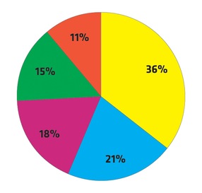
The participant was told that they would be dropped into this country with equal change of ending up in any of the five quintiles. By using John Rawls’ original position theory, Ariely seemed to believe that with no prior knowledge of their position in the society, the participant would choose the country with the greatest equity of wealth between the five wealth levels. The participant should choose the countries in which he or she will have the greatest chance of not being dirt poor.
The first few pie charts showing the divisions of wealth are unlabeled, leaving the participant to choose based on the actual divisions of wealth one sees in the chart. Later in the survey, the pie charts are labeled with countries like Great Britain and Haiti, indicating that the wealth division pie chart represents the wealth division in the labeled country.
In this experiment, Ariely seemed to be attempting to understand not what kind of wealth equity people desire in a society in which they are not guaranteed a certain place, but how people choose given little information. It is likely that a participant who chose to live in Haiti’s unmarked wealth division pie chart over Great Britain’s would likely choose the reverse given a labeled pie chart. The pie charts have not changed with the inclusion of labels, only the participant’s perception of the pie charts has changed. Perhaps people have more faith in first world societies ability to provide for its people despite unequal distribution of wealth. Even with the facts in place, regardless of wealth distribution despite that being the question, people will likely choose to live in countries they consider wealthier by comparison.
This is relevant today because of the recent attention to inequalities in wealth in the United States in the Occupy Wall Street movements as well as in the presidential campaign. This article at PBS describes the gains in wealth to the top one percent in recent years.

If anyone is interested, Ariely’s resulting article was published in Perspectives on Psychological Science, titled Building a Better America, One Wealth Quintile at a Time, available in pdf form if you google it:
No comments:
Post a Comment